
Investor Returns Portfolio
Product Designer | June - July 2018
The Internal Rate of Return dashboard shows an investor the condition and performance of their investments — whether the investment is worth more or less, or if the company has shut down completely.

The Problem:
This is the biggest hole in our product. Some of the oldest investments on Wefunder are 4-5 years old now, old enough that investors are starting to see results. Since we lack a tool to report results, we have completely neglected the post-investment experience and as a result, a lot of investors have lost confidence in the Wefunder product. This has affected customer lifetime value and the proportion of investors who go on to make second investments (used to be 30% and is now 20%).
The Goal
To help users understand how their investments are doing and feel secure about the investments being in holding. The hypothesis is that if investors are given transparent and timely updates about their investments, they are more likely to engage with the product, invest again, and refer Wefunder to their friends.
The user
Investors who have confirmed investments on Wefunder. The demographic is majority male, with location concentrated in the costs and tech hubs, and 70% under the age of 50.
The Project
Two designers (me and one full-time contractor) and one senior engineer. Two operations humans for gathering data. Two weeks for design, one month for engineering.
Understanding the Problem
My team mate Linlin and I sat down and tried to spec out everything from the types of investments listed above and the various states and edge cases. This step was important in helping us understand what we were dealing with.
The Backend
This project required heavy involvement from engineering. There were some engineering details to consider like how shares and investments are tracked that would affect how we can display the measurements.
Practicality
As the operations currently is, there are often delays in repayment schedules and general lack of updates from founders and about the companies. It is highly likely there won’t be abundance of data.
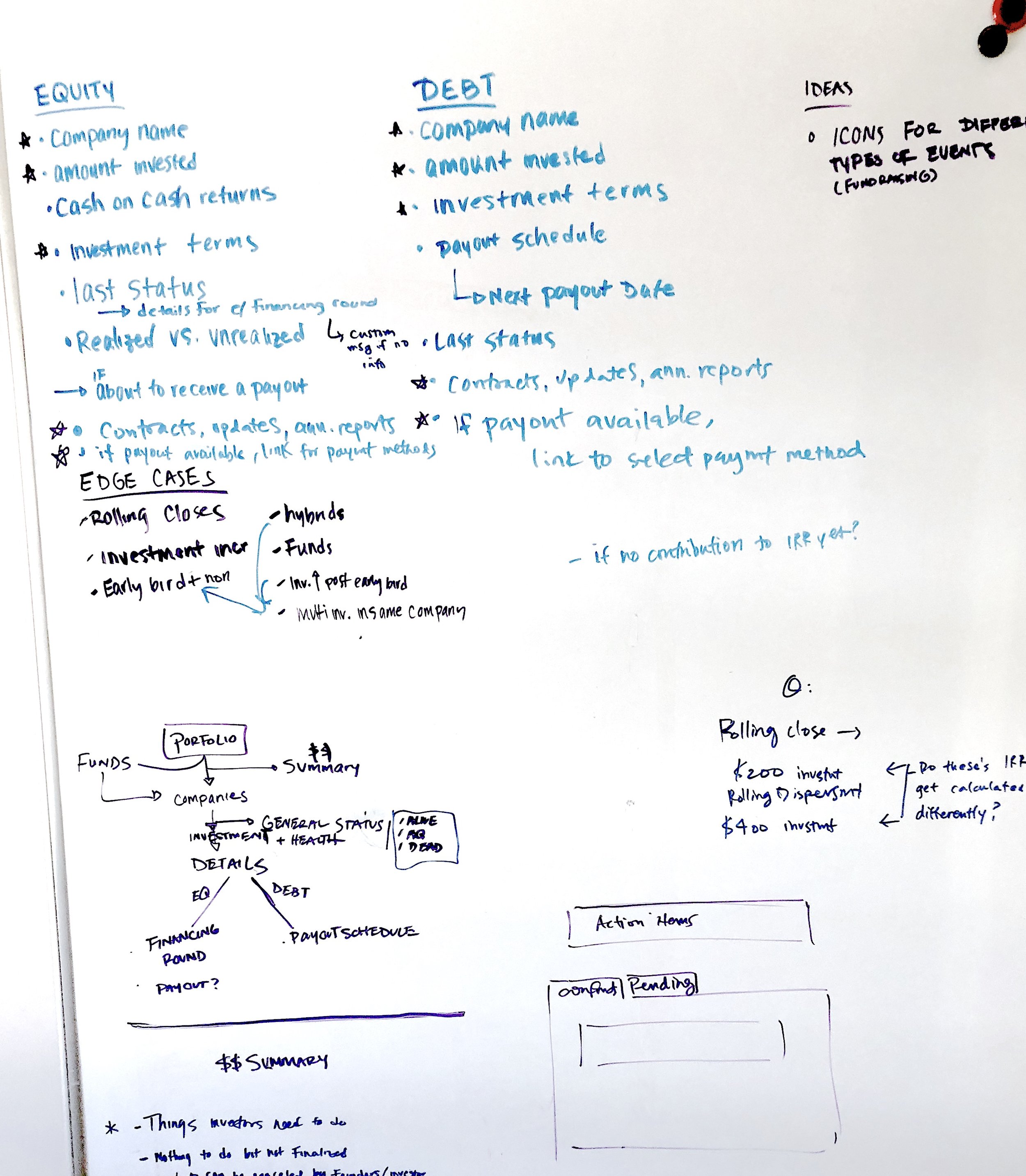
After polling our team members and some friends of mine who are active but not sophisticated investors, Linlin and I arrived at some key things users wanted and we needed to address:
At-a-glance Performance
The investments grouped by company
Our hypothesis was that our users’ mental models followed companies they invested in and not specifically the contract type. Thus it was important to group by company, not date of campaign, not security type, not state of company.
Opportunity to Educate
History of the investment
Relevant Updates or Tasks
Should include any relevant payout options or recent updates posted by the founders.
The Final Thing

Key performance numbers at the top for easy access.
Investments grouped by company
Companies will usually not have both payout and cash on cash, but we chose to follow the same format so investors become acquainted with the security-specific terms.
A typical investment will be shown as follows:

At the top we will show most recent update from the founder or us. Below that is a ledge of all shares activity, including follow-on financing.
This includes the entire history of the investment to the best of our knowledge, including relevant reports or contracts.

Similarly, if a company has had multiple fundraises with Wefunder, we will also capture the activity in one entry.

We also show the status of the company in the ledger as well as visually indicate so.
Acquired companies will show strike throughs and new company/parent name. Failed companies will be grayed out. Exited companies will show terms of exit.
More detail on specific security types

For debt investments, there will be a payment schedule. Again, if a payout is available, the user will be able to indicate payout method here. If the payouts are late, it will indicate so.

Funds are treated as an “investment” in terms of architecture, with its own collection of companies. It has the same interaction. If a company fails, it is grayed out.

If you expand the company within a fund, you’ll find a similar UI compared to individual investments.
Outcome
The tool was built about a month after the handoff from design. Unfortunately, the gathering of the data has taken longer than expected and we are still waiting on the rollout of the IRR page. Because of this we haven’t been able to measure the effects.